
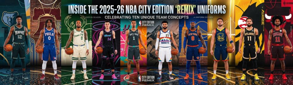
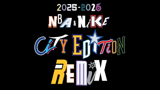
Every autumn the NBA hands its designers the same brief with a new twist, and the 2025-26 NBA City Edition uniforms answer it by looking backward on purpose. The league calls this year’s collection a Remix: most teams took a previous City Edition set, recolored it, and paired it with a matching court, while a handful simply brought back a fan-favorite look that never should have left. Since the program launched in 2017-18 to honor each market’s history, culture, and landmarks, City Edition night has become the one evening when a team’s identity, not its record, is the story.
That is also why reveal week now behaves like a small sporting event of its own. Fans line up for drops, argue over which throwback deserved a comeback, and keep the buzz going between games, whether that means refreshing resale listings or pulling up somewhere to play live casino while they wait for tip-off. The jerseys, though, are the part worth slowing down for, because each one is a compact piece of civic branding.
Read them side by side and a pattern appears: the strongest City Edition looks are not the flashiest, but the ones that translate a specific local story into a crest, a colorway, or a single well-chosen detail. Here are the designs from the 2025-26 set that do that best.
The 2025-26 NBA City Edition uniforms have sparked excitement and conversation among fans, as each team showcases its unique identity through these vibrant designs.
Memphis Grizzlies: a jersey that sounds like the city
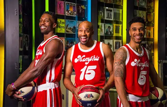
Celebrating 25 seasons in Memphis, the Grizzlies built their City Edition around the sound that put the city on the map. The design nods to Stax Records and the legacy of Isaac Hayes, turning the team’s uniform into a tribute to Memphis soul rather than a basketball graphic. It is branding by association: wear the jersey, and you are wearing the city’s musical history, which is exactly the kind of meaning a logo alone cannot always carry.
Philadelphia 76ers: cracked but never broken
The 76ers reached for the most Philadelphia object imaginable, the Liberty Bell, and let its most famous flaw do the talking. Their City Edition frames the bell as a symbol of resilience, cracked but never broken, silent but still heard, and channels that into bold detailing. It is a smart branding move because the reference works on two levels at once: instantly legible to anyone who knows the landmark, and quietly flattering to a fan base that prides itself on tenacity.
Milwaukee Bucks: the return of Cream City
Milwaukee revived its fan-favorite Cream City uniforms, first worn in 2019-20, and the name is a genuine history lesson. The cream colorway points to the pale clay bricks that builders used across Milwaukee in the mid-to-late 19th century, bricks so common the town earned the Cream City nickname. Bringing the set back reminds us that a great City Edition often ages into a permanent part of a team’s visual vocabulary rather than a one-season experiment.
Miami Heat: Vice Nights, twenty years on
Few City Edition looks have sold as well as the Heat’s Vice design, and for 2025-26 the Original Vice Nights uniform returns as one of the league’s most popular City Edition looks. The tweak this year is a commemorative patch marking the 20th anniversary of Miami’s 2006 championship, a small addition that layers team history over the neon-soaked branding. It is a case study in how a color palette, rather than a logo, can become a franchise’s signature.
San Antonio Spurs: Fiesta comes home
San Antonio brought back its own best-seller, the Fiesta colorway, a palette lifted from the team’s 1990 warmup jacket and woven into the culture of the city’s annual celebration. For a franchise long associated with restrained black and silver, the pink, teal, and orange burst is a deliberate act of local branding, a reminder that a team’s identity can live in a warmup jacket as much as in its primary mark.
Denver Nuggets: the skyline returns
Denver reached back to one of the most beloved looks in franchise history, reviving the Skyline design with its 1980s-and-90s rainbow striping and the mountain skyline stretched across the chest. This remix swaps the wordmark to read Denver rather than Nuggets, leaning into civic pride over team name, a reminder that a City Edition is meant to represent a place first and a roster second.
New York Knicks: the World’s Most Famous Arena
The Knicks brought back their tribute to Madison Square Garden, the building they call the World’s Most Famous Arena, with royal blue checkered side panels and orange piping. It is a rare angle: most City Edition jerseys celebrate a city or a history, while this one celebrates a room, trusting that the venue itself is a strong enough piece of identity to carry a uniform.
Golden State Warriors: keeping The Town
Golden State reworked its 2019-20 The Town design, which honored Oakland with a stylized oak tree on the chest and details drawn from the Bay Bridge. Even after the franchise crossed the bay to San Francisco, keeping The Town alive is a branding decision loaded with meaning, preserving a piece of identity that much of the fan base still holds onto.
Atlanta Hawks: straight down Peachtree
Atlanta’s Peachtree remix takes its cue from Peachtree Street, the thoroughfare that runs through the city’s identity as surely as it runs through downtown. Peach-toned accents tie the look to Georgia’s Peach State nickname, turning a place name locals say without thinking into wearable civic shorthand.
Chicago Bulls: four stars for the city
Chicago revived a City Edition built straight from the city flag, pairing a script Chicago wordmark with the flag’s light blue bars and four red stars down the sides. It is one of the cleanest pieces of civic branding in the league, because the reference needs no explanation to anyone who has ever looked up at a flagpole in the city.
Why the Remix approach works
Recoloring old City Editions could have felt like a shortcut, but the 2025-26 set shows that revisiting a strong idea is its own kind of design discipline. The looks that returned did so because fans had already adopted them, which is the truest test any sports identity faces. It mirrors a broader mood in team branding, the same instinct behind why so many franchises are falling back in love with nostalgia rather than chasing the next flat redesign. When a jersey earns that loyalty, the smartest move is often to bring it back, tweak the details, and let the story keep running.
That is the throughline across all thirty teams this season. The best City Edition uniforms are not really about basketball. They are about place, memory, and the visual shorthand a city agrees to share, which is the whole reason a jersey can say more than a scoreline ever could.